Actions
Bug #573
closed
RNA - 165 (Several UI fixes)
Start date:
10/09/2025
Due date:
% Done:
0%
Estimated time:
Description
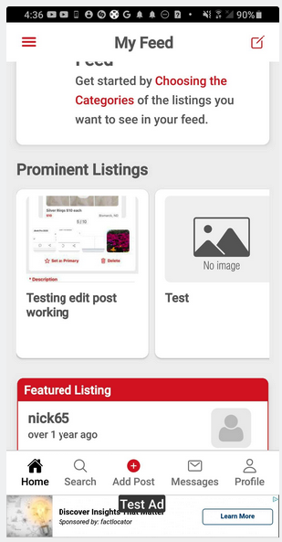
- the carousel for the prominent listings should have a shadow or be transparent as it scrolls off the screen, right now it has a hard line. a shadow or transparency on both edges would better blend it.
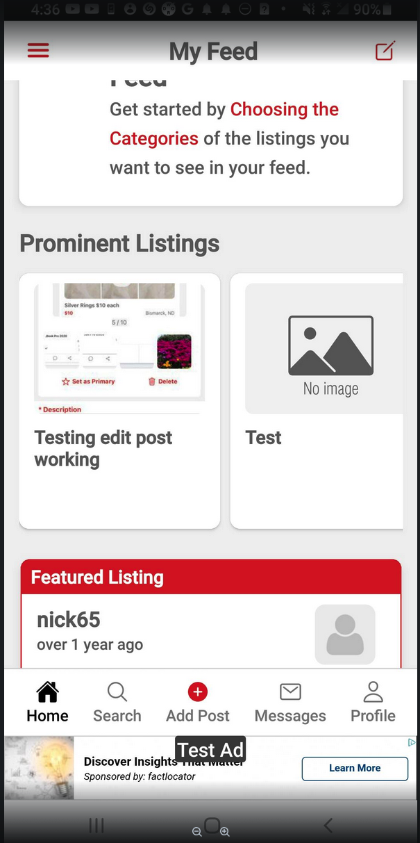
2)We should put a thin grey bottom border on the header (the header that contains “my feed” “cars”, etc) container, the bottom border should be the same grey color as the page background, this will distinguish the header from the content on the page as the user scrolls. Make sure all headers match, including in the post details pages.
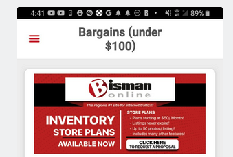
3)The bargains (under $100) looks sloppy, the “(under $100)” should all be on the second line not cut off
4)the background of the post details page is white… it should match the rest of the app and be grey
Files
 Updated by Mubashir Siraj 9 months ago
- Status changed from In Progress to Resolved
- Assignee changed from Mubashir Siraj to Abdullah Khalid
 Updated by
Actions